
Commemorating 50 years since the first flight of Concorde again (first on Vintage Aero Writer here) let’s take a look at a now iconic stamp design by David Gentleman, a remarkable artist in Britain, in any measure, and in many arts.

Today the pre-decimal ‘1/6’ value in the corner looks like it belongs to a previous era, as it does, but the rest of the design is so clean, it is timeless – and stands well today, a half-century later.
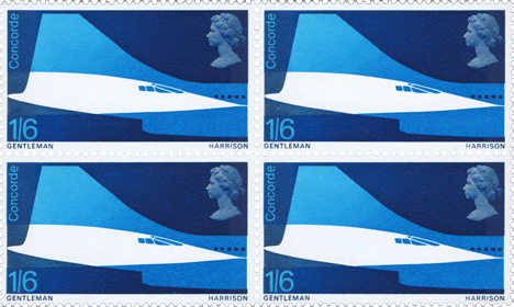
This is one of the set of stamps issued, and the strongest, I think of the three. Two were designed by Gentleman, one by Michael and Sylvia Goaman and issued as ‘First Flight of Concorde’ by the GPO on 3 March 1969, the ‘Harrison’ referring to the printers.

Some fascinating background to the stamps’ story is covered below, by Gentleman himself from ‘The Machin Story’ here.

Notice the incorrect English spelling of ‘Concord’ on the rejected version on the left. Even though the name means ‘agreement’ the differing spellings of Concorde/e in French and English needed a decision to be made, ironically, in favour of one, which fell to the French spelling with the ‘e’ for the aircraft.
The left hand design was rejected, like the one below, as the hinting of the supersonic nature of the aircraft was regarded as something to avoid, given the risks of the sonic boom were already gathering significant negative public feeling.

There were several original designs following an unsolicited proposal that started the British project – the French having decided to produce another design – but one which was a very traditional artwork. Most of the British proposals have a modern feel, and look to have potential, as seen here, with Margaret Calvert’s design including the red white and blue of the two nations’ flags and maps overlaid, under a joining Concorde silhouette.

A personal declaration. I didn’t like the designs when I first saw them, soon after issue. But today I think they are a strong pair of designs in Gentleman’s artwork, as they are highly regarded today.
Unsurprisingly, there’s a post-script. Concorde’s sleek design does get used in a similar format elsewhere. Here’s a mural design by Tom Eckersley, here.

James Kightly, Vintage Aero Writer.
References in the text, and: David Gentleman’s website here, and Wikipedia page here. The Postal Museum’s page here, Postal Heritage page here, a good analysis on the Wokingham & District Philatalic Society page halfway down here. Flickr page for high res versions of the stamps here. The Machin icon introduction by Gentleman here.
